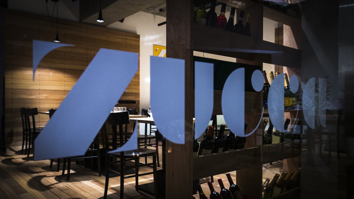
Zucca Restaurant
Shibuya, Tokyo, Japan, 2012
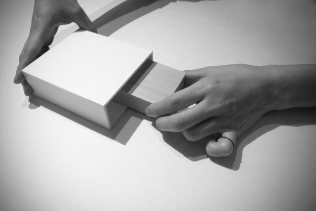
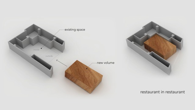
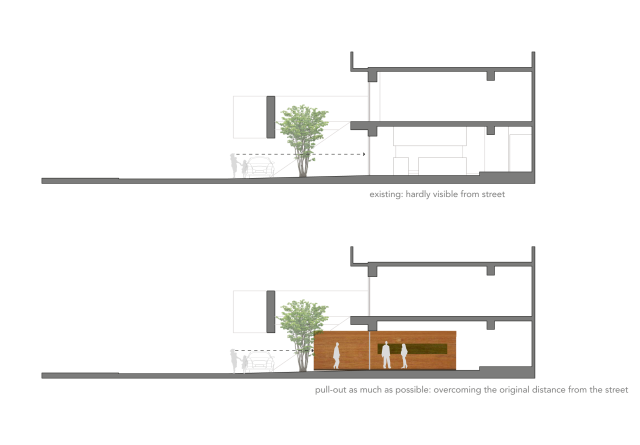
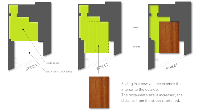
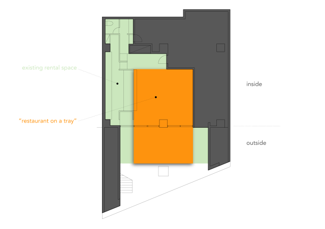
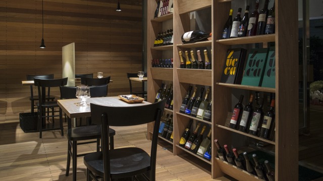
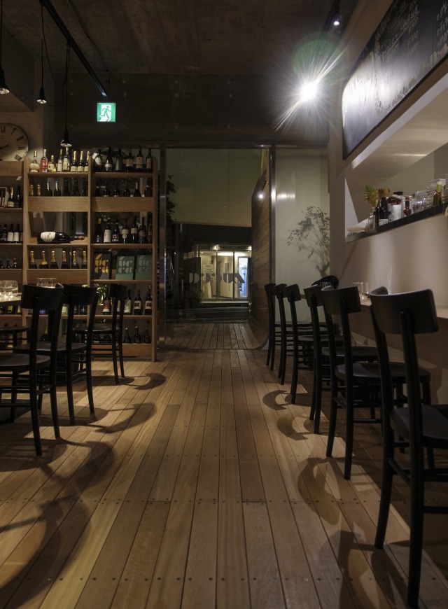
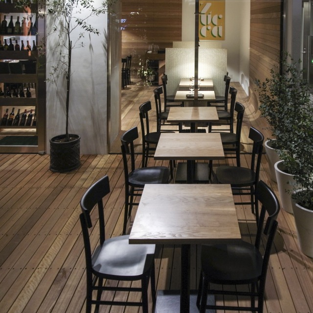
Somewhat of a hermit crab situation: You find a shell that will fit you, as it is one of those shells that you are supposed to be in, and yet it isn’t really perfect for you, itches here and there.Our design revolves around this point: Rather than merely occupying the existing shell, we inserted a volume that extends towards the street – as much as rentable space will allow – and thereby creates an inviting space that almost doubles the restaurant’s size.
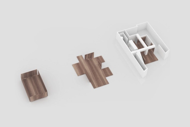
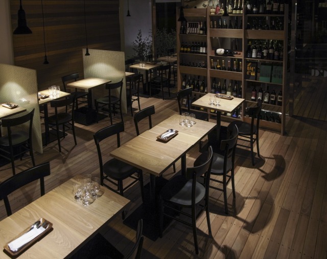
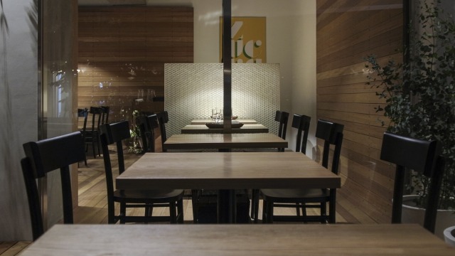
Of course, as the hermit crab inhabits the shell, he finds his way, adjusts to it, redefines it: The core of the new restaurant seems to unfold towards all sides, almost becomes a giant wooden tray – as soon as you step on it, you become part of the restaurant where inside and outside are perceived as one. The shell's itchy parts are left almost untouched, the new core receives, like the guests on it, all attention.
–
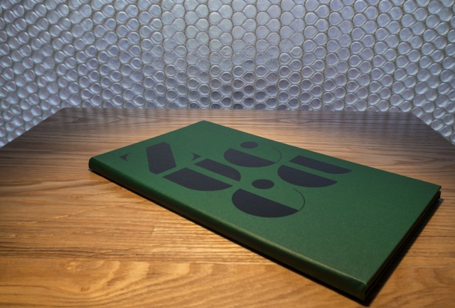
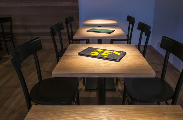
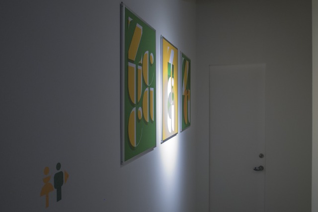
Graphic design (logo, menus, signs, business cards, and posters) and website by Edith Prakoso.
Shibuya, Tokyo, Japan, 2012
Type
Status
Team
Florian Busch, Tomoyuki Sudo, Seiko Yuki, Akira Miyamoto
Graphic Design: Edith Prakoso
Contractor: Indect
Client: Zucca Retro Italian Dining
Size
GFA: 89 m²
New wooden core: 58 m²
Al fresco terrace: 22 m²
publications
Related Projects:
- Nobori Building, 2021—2023
- Y Project in Kagurazaka, 2017—2018
- K8, 2014—2015
- Zucca Restaurant, 2012
- RG Project, 2009
